Sunday 30 June 2013

Final Project: How Technology affects our Life

Artist Statement:

The idea that why I draw this sketch is
we need to bring a lot of thing when we are hanging out before we have Smartphone.
After we have smartphone,we don't need to bring a lot of thing like camera, calculator, magazines, GPS and other else, , we just bring a Smartphone because it's all in one already.
The invention of Smartphone have brought conveniences to us.


My Design Progress:


This is my original sketch


Step 1:  Adjust the image size to A2 size (420mm*594mm)
Image>Image Size>Document Size: width:594, height:420, resolution: 300 


Step 2: Use Magnetic Lasso to cut all of the iPhone's logo and colour all of the logo 
by using Paint Bucket Tool,Brush Tool and Pencil Tool.

 Step 2

Step 2


Step 2


Step 3: Start to colour the desktop background and the case of the iPhone 5
Used Tools: Paint Bucket Tool,Brush Tool and Pencil Tool.
ps: I have considered a picture scenery
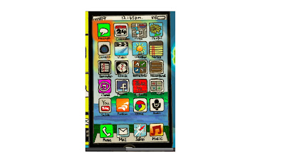


Step 4:  Colour the Nokia Lumia and write the NOKIA logo with Pencil Tool
Used Tools: Paint Bucket Tool,Brush Tool and Pencil Tool.


 Step 5:  Colour the case of  Samsung S4 and write the SAMSUNG logo with Pencil Tool
Used Tools: Paint Bucket Tool,Brush Tool and Pencil Tool.


Step 6: colour the Dial logo by using Paint Bucket Tool and Brush Tool


 Step7: Colour the background of Samsung S4
Using the Magnetic Lasso select the part of the background and fill with Gradient
Used Tool:  Magnetic Lasso Tool, Paint Bucket Tool,Brush Tool and Pencil Tool.

add on the background of time and google to the Samsung S4.


Step 8: Start to colour the right hand part, the camera.  
I coloured the camera by using Magnetic Lasso and fill in the colour.
Besides, I also used the Paint Bucket Tool.


Colouring the phone and sound recorder.


I coloured the magazines & newspapers, GPS 


And the Calculator, Clock, Calender, Gameboy, Dictionary, Notes, Memo 


Last, is the TV,the part of the right hand side 


Step 9: Create 3 new layers for drawing the Earth.
First Layer: Draw the blue colour circle shape.
Second Layer: The shadow of the Earth.
Third Layer: The green land of the Earth.
Convert three of the layers to Smart Object together and rasterize the layer.


Step 10: Move the Earth to the background.


Step 11: Type the word "Smartphones make our life more convenient "
Use the Brush Tool to draw the background with around 3 colours from blue.


Done!!


Collage-Malaysia


Monday 17 June 2013

Trip to National Visual Art Gallery


At 6th June, we had a trip to visit the National Visual Art Gallery.

In the gallery, there have many drawings!
There are various of drawings which were drawn by the artists.
There have two impressive drawings to me.


First
First of them is ' Someone Forgotten (dream & reality)', which drawn by Wong Woan Lee in 1999.


This drawing make me think of my father, because he is an old father.
Sometimes, he will forget something like does he has his dinner or not.
He always lies on the bed, and thinks of the past things, just like the man who in the drawing.
Sometimes, he is also very confused with his past things, then he will become sad, angry, happy...........

I am studying in KL now, 
I'm sad, because my parents are old already but I can't accompany around them everyday now.
Besides, my English is poor, 
I'm afraid of I can't handle my studies and can't achieve the good results during my University .
Although my parents told me don't worry about it, I still feeling a little bit worried about it, I'm afraid of I will let them down....

I will try my best to do everything just for my parents!!


Second

The second of them is 'Dan Master itu sedang Bekerja' which drawn by Hamir Soib @ Mohammed.

In the picture, there is a clown who is talking to the audience.
It makes me think of my Secondary School Teacher.
During our secondary school life, we were chitchating or sleeping in the class.
I am feeling extremely guilty now. 
Teachers, I'm so sorry!!!!!


Sunday 16 June 2013

Art Movements-Realism (arts)

Realism in the arts may be generally defined as the attempt to represent subject matter truthfully, 

without artificiality, and avoiding artistic conventions, implausible, exotic and supernatural elements.

this picture was drawn by Gustave Courbet in 1854.


Realists rejected Romanticism, which had dominated French literature and art since the late 18th century.


Realism in the arts may be generally defined as the attempt to represent subject matter truthfully, without artificiality, and avoiding artistic conventions, implausible, exotic and supernatural elements.

 More generally, realist works of art are those that, in revealing a truth, may emphasize the ugly or sordid, such as works of social realism, regionalism.

The movement even managed to impact on opera, where it is called Verismo, with contemporary working-class heroines such as Carmen.


Visual Art
Realism as a style or movement needs to be distinguished from "realism" as a term to describe the very precise, detailed and accurate representation in art of the visual appearance of scenes and objects. 

As an art movement Realism was a reaction in the mid 19th century against what was seen as the artificiality of Romanticism, led by Courbet in France. It spread across Europe and was influential for the rest of the century and beyond, but as it became adopted into the mainstream of painting it becomes less common and useful as a term to define artistic style.

After the arrival of Impressionism and later movements which downgraded the importance of precise illusionistic brushwork it often came to refer simply to the use of a more traditional and tighter painting style. It has been used for a number of later movements and trends in art, some involving careful illusionistic representation, such as Photorealism, and others the depiction of "realist" subject matter in a social sense, or attempts at both.

Monday 10 June 2013

A Meaningful Photo


This photo was taken around in 1989-1994 by an Chinese man whose name Yuan Dong Ping ( Chinese: 袁冬平)

They were the psychopaths who lived in a Mental Hospital.
According to the record in 2007, there were about 300 million peoples who had psychosis over the world.
Part of the serious psychopaths would be arranged for admitting to the Mental Hospital.

Many people feel that Mental Hospital is a place which full of fear to them and fell very horrible, because there are a lot of psychopaths living at there.


In fact, they are poor because some of them will be abandoned by their family and live at there forever.
From this photo, I feel that the psychopaths who lived in the Mental Hospital were looked like very happy and lived without vexation. Actually, they maybe had undergone a lot of failures, being excluded, unusual sight, stress or something else. In their deep heart, they were feeling helplessness, heavyhearted, feeling loneliness or something else.

In my opinion, they were escaping from all the problems, challenges or difficulties which they were facing. They couldn't to handle or solve the problems, challenges or difficulties, they are confused, and became a psychopath is just a way for getting out of  all the problems, challenges or difficulties.

Wednesday 5 June 2013

My Favourite Colour

Colour is an interesting and fantastic element in our life.
It can make our world and life become colourful and we can express our emotion through colours.

Colour will influence someone's viewpoint and emotion, such as while someone is driving, someone sees that, there have a red cloth is being shaken, someone will think that, there is danger or there are a project being  proceeded, so someone will reduce his or her driving speed.

I'm very greedy, I like all of the colours which available in our planet, but the most three my favourite colours are Navy Blue, Red and Black.

Navy Blue(#000080)


  • a very dark shade of BLUE
  • name come from the usual colour of uniform of British Sailor in the early 19th century
  • initially called Marine Blue
  • an emotional colour, but also tried to cover up something, women with navy blue character might like binge drinking may also like to go shopping.


RED(#ff000)
  • danger, warning, anger, blood,attractive, fashion and passion colour
  • primary colour
  • comes from Old English 'rēd'
  • In Chinese Cultural,
    • red is a happiness and lucky colour
    • usually used during Lunar New Year, weddings,celebration and other
    • red colour can repel the evil
  • Strong personality and energetic, outgoing personality, always ready to debate or take the offensive awareness and say quickly without thinking.
BLACK(#000000)

  • secret, magic,power and the darkest colour
  • colour of coal, ebony, outer space and more.
  • in China Cultural, black is an unlucky colour, it won't be used during a wedding or a celebration usually.

    picture: 


reference:Wikipeida & Baidu

Tuesday 4 June 2013

Design Elements


Design Elements

1. Line

Line is straight or curved.
There are two ways for considering of line. 
We can use a pen or brush for drawing the linear marks or the edge created when two shapes meet.


2. Shape

A shape is defined as an area that stands out from the space next to or around it due to a defined or implied boundary, or because of differences of value, colour, or texture.


3. Direction

All lines have direction - Horizontal, Vertical or Oblique.

Horizontal : Suggesting calmness, stability and tranquillity.
Vertical : Giving a feeling of balance, formality and alertness. 


4. Tone / Shape
Size is simply the relationship of the area occupied by one shape to that of another.


5. Texture

Texture is the surface quality of a shape - rough, smooth, soft hard glossy etc. Texture can be physical (tactile) or visual.

Types of texture:
  1. Tactile texture is the actual three-dimension feel of a surface that can be touched. Painter can use impasto to build peaks and create texture.
  2. Visual texture is the illusion of the surfaces peaks and valleys, like the tree pictured. Any texture shown in a photo is a visual texture, meaning the paper is smooth no matter how rough the image perceives it to be


6.Perspective


The principles of design

  1. BALANCE
    Balance in design is similar to balance in physics. A large shape close to the center can be balanced by a small shape close to the edge. Balance provides stability and structure to a design. It’s the weight distributed in the design by the placement of your elements.
  2. PROXIMITY 
    Proximity creates relationship between elements. It provides a focal point. Proximity doesn’t mean that elements have to be placed together, it means they should be visually connected in someway.
  3. ALIGNMENT
    Allows us to create order and organisation. Aligning elements allows them to create a visual connection with each other.
  4. REPETITION
    Repetition strengthens a design by tying together individual elements. It helps to create association and consistency. Repetition can create rhythm (a feeling of organized movement).
  5. CONTRAST
    Contrast is the juxtaposition of opposing elements (opposite colours on the colour wheel, or value light / dark, or direction - horizontal / vertical). Contrast allows us to emphasize or highlight key elements in your design.
  6. SPACE
    Space in art refers to the distance or area between, around, above, below, or within elements. Bothpositive and negative space are important factors to be considered in every design.


Saturday 1 June 2013

Abstract Painting


Exercise of 'Introduction to Design' , Abstract Painting.
I have spent few hours for doing this exercise ,  very tired but satisfied too!
My inspiration is come from my housemate, because she made cocktail for us~


It's around 7 layers.

Brush,Rectangle Tool,Line Tool and Paint Bucket Tool are the tools which I used mostly.
And I used 'ZigZag' function(Filter>Distort>ZigZag)to let the rectangles became irregular.

The main material is colours of  RAINBOW.
It perfectly represented that cocktail is an alcoholic mixed drink.
It can be mixed with various material such as Spirit, Fruits Juice, Bitters and even more.

Various colours can represent various mood.
When a variety of different flavours mixed together, it can create a tasty, fantastic and excellent COCKTAIL!